gluent.

Introduction
The Problem:
People often give up on language learning tools.

Project Summary:
Language learning is a hobby of mine, so as a passion project, I completed a design project for this space. I conducted user research and arrived at an MVP for a language-learning app with the goal of high user retention. The scope was to create user onboarding and a short lesson. Based on the research, I minimized the repetition of material that users consider easy to meet this goal.
My Role:
UX Research, UX/UI Design
The Solution:
An app that prioritizes repeating difficult content, and minimizes repeating easy content in order to mitigate boredom due to users reviewing content they already know.
Research
I interviewed language learners and devised a survey that yielded 100+ responses. Many users quit because they were forgetting what they learned or had lost motivation.
As I learned in an interview, one user complained that online language learning was excessively repetitive (“it was ridiculous”). Another person said he was "barely able to communicate" when traveling, despite having made progress on Duolingo.
Further research revealed that people complained about boring and tedious tools.
I synthesized my research findings in an affinity map to see patterns in the data. This served as a place to organize and digest all my findings. The act of writing out responses and quotes also helped me empathize with the users.

The biggest user needs are having an enjoyable and not overly repetitive way to learn Spanish, as well as retaining progress and learning about Spanish culture.
Synthesis

This journey map allowed me to visualize the pains encountered throughout a language-learning session
According to the survey and interviews. the top the most cited pain points were:
1. Excessive repetition
2. Forgetting what they’d learned, and
3. Loss of motivation.
Next, I researched learning techniques and discovered that “spaced repetition” is highly effective. With this method, users review difficult material more often than easy material. This cuts down on boredom by prioritizing difficult material. In testing, recall (used for fill-in-the-blank questions) requires more effort than answering multiple choice questions, but is a better indicator of learning.
I also researched learning and motivation. Interestingly, extrinsic motivation (points or grades) is easy to instill, but is short-lived. Intrinsic motivation (passion and genuine interest) is harder to instill, but leads to continued learning.

To minimize churn rate, this app should seek to instill intrinsic motivation, unlike many of its competitors
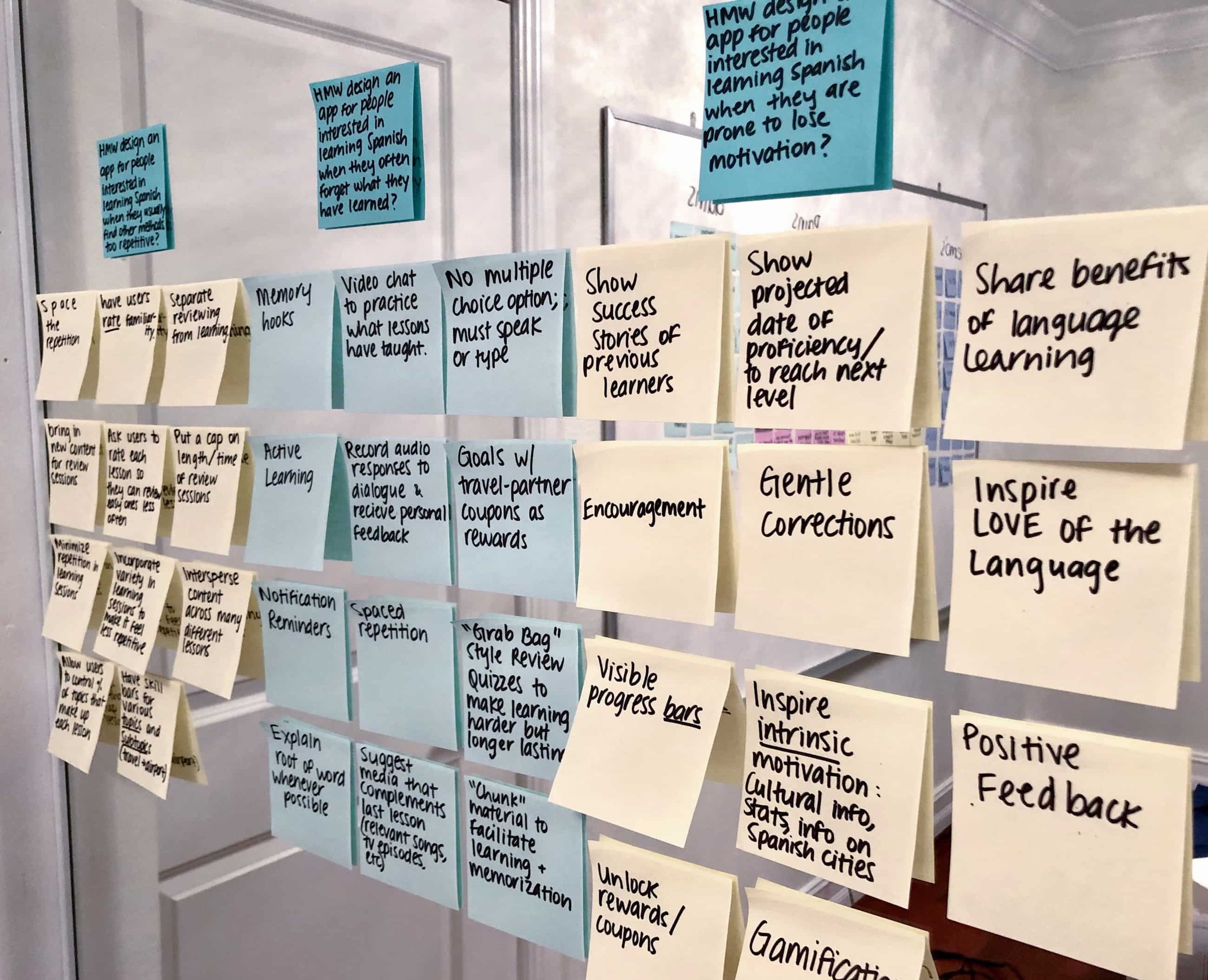
Ideation
To guide my brainstorming, I devised “how might we?” statements for the 3 main user pain points (excessive repetition, forgetting what was learned, and loss of motivation). I like to use sticky notes during ideation, I find I generate more ideas this way as opposed to typing out my ideas digitally.
I loved so many of my ideas but sadly, implementing all of them wouldn't have been feasible. In comes the MoSCoW method!
Considering the impact on the user vs the effort for the business, I determined which features should comprise the minimum viable product.

This feature prioritization method clearly shows which items have the most “bang for our buck”
The minimum viable product is a mobile language-learning app for people interested in learning Spanish, that
• Allows users to rate session difficulty,
• Has few multiple-choice options, and
• Suggests music to complement lessons
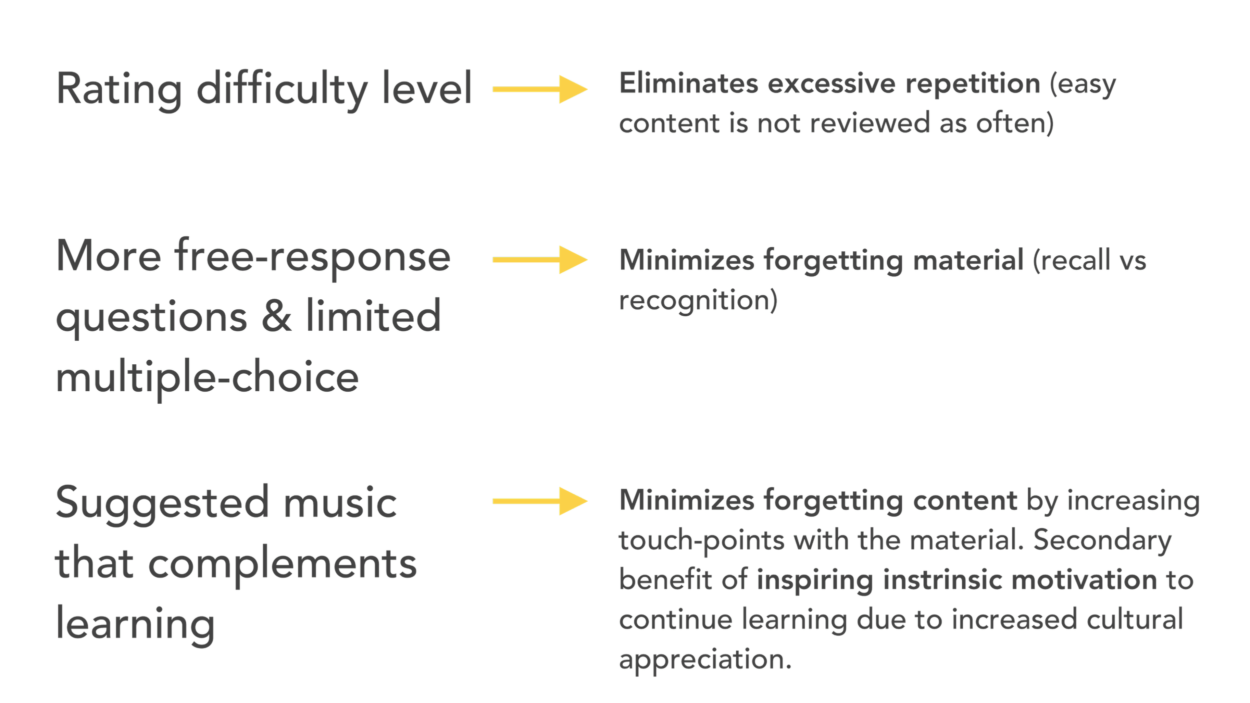
Pain points addressed by the MVP features
Interaction Design


I sketched a variety of lo-fi wireframes for each needed screen, then selected which ones to prototype and conduct usability testing for
I conducted 7 usability tests on Maze to identify room for improvement in my design. The average task duration was 108.5 seconds with a 14.3% mis-click rate. Users preferred a numerical scale to rate lesson difficulty, rather than simply choosing “easy” “medium” or “difficult.” I also learned that being given a suggested list of music after each lesson could interrupt learning and ultimately result in fewer lessons being completed. I made the needed changes in the mid-fidelity prototype, then did another round of usability testing before moving on to visual design determination.
One concept I explored but decided it was too micro-interaction heavy and slow.

Next Steps
Next up I will design the remaining pages of the lesson (including having the user speak into their phone, as well as complete onboarding). One major undertaking is the need to conduct research on information architecture. Namely, how should I structure the lessons and content? Levels of difficulty? What is the high-level progression of learning the language?
In the future, I would also explore demand for adding both a placement quiz to help users gauge their current fluency level, as well as the possibility of updating the music section to be media, and adding Spanish TV shows and movies. The purpose would be to further cement learning, as well as to inspire cultural appreciation and thus intrinsic motivation to continue learning. I hypothesize that this would help minimize the number of users who give up learning. Another enhancement I would consider is goals, as most competitors have this feature.
To enhance the visuals, I would have custom, branded graphics created for the learning cards as well as the welcome screen. This is because emojis are limiting and can be somewhat vague.
Conclusion
The primary metric to gauge product performance would be user retention, with secondary metrics of weekly active users, the proportion of users accessing the curated playlist, the rating on the app store, and the churn rate. Being that this is an MVP, I'd like to get baseline metrics for these factors, then use the change in these metrics to help gauge future design changes.